I found the gaps in the system and filled them.
I contributed components and patterns to Carbon from inside the product teams using it — finding the gaps, proposing fixes, and seeing them adopted as system-level standards.
A design systems lead needs to spot system-level gaps and turn them into shared standards. This shows exactly that — identifying real problems in product, working through the contribution process, and seeing the work elevated into Carbon core.
The contributions
Overview
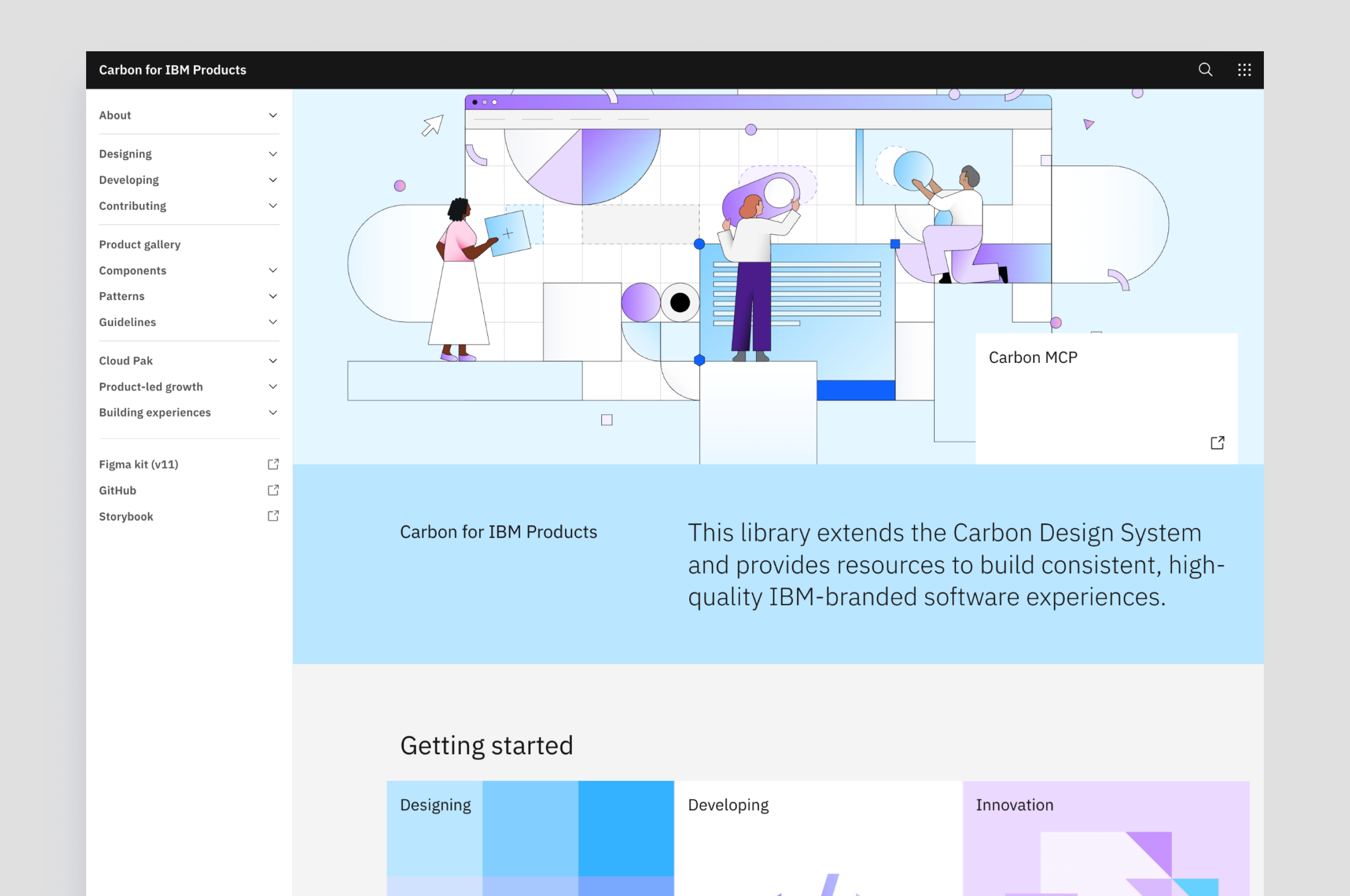
Carbon is IBM's open-source design system. It sits at two levels: Carbon core sets the foundations; Carbon for IBM Products extends them for enterprise product teams.
Contributions work bottom-up — designers embedded in product teams spot gaps and propose changes through a formal process. If accepted, product-level fixes become system-level standards.
All of this work happened outside my day job as a visual designer embedded in product. I did it because I was passionate about design systems and wanted to make things that helped other designers work better.
Button guidance
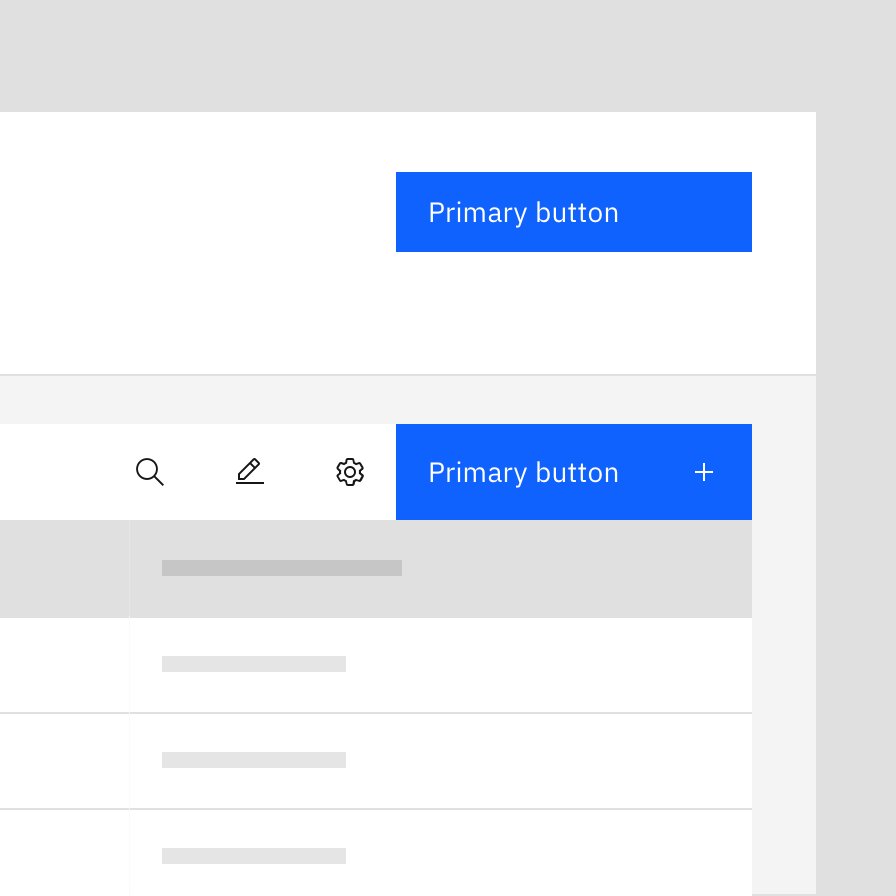
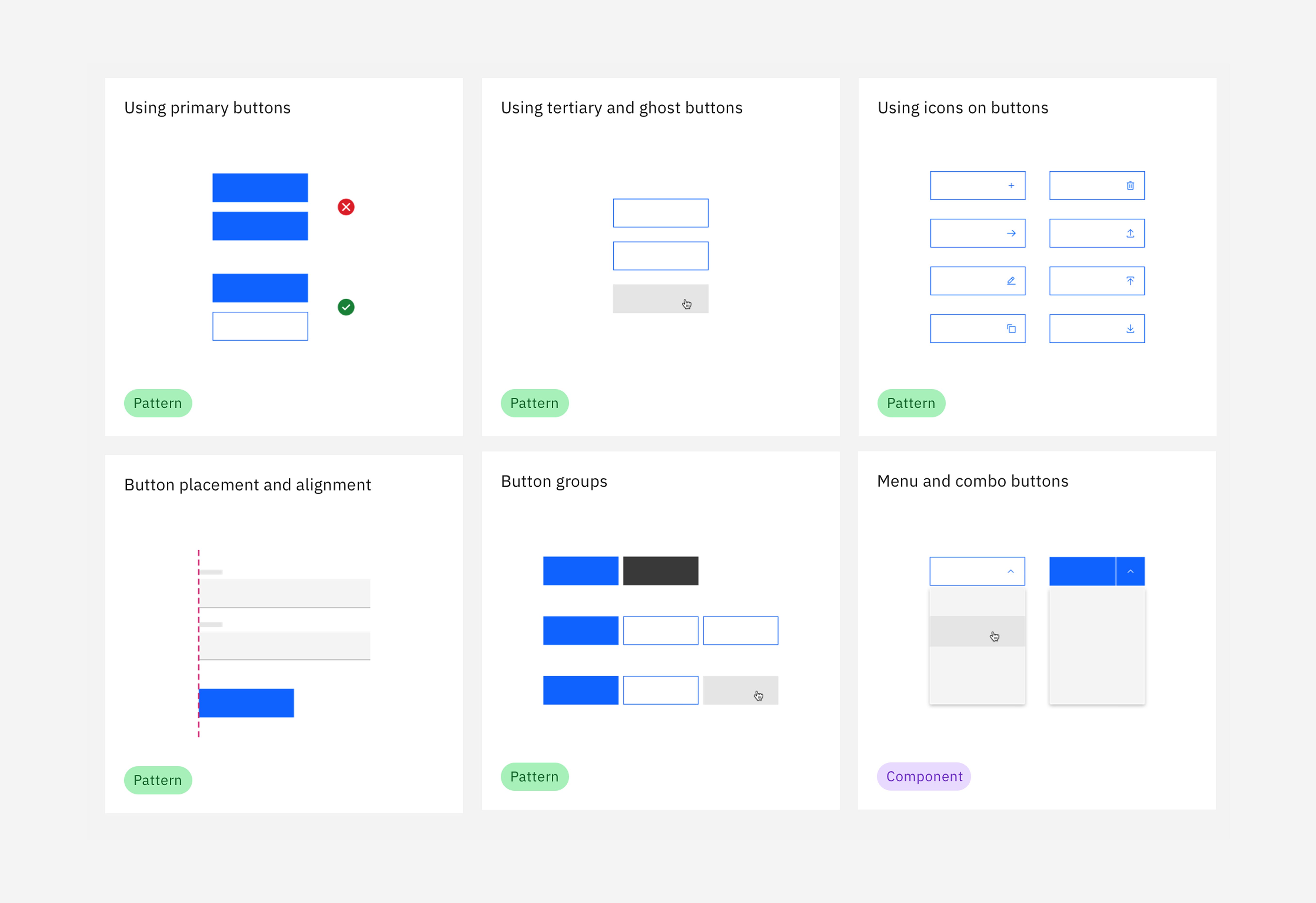
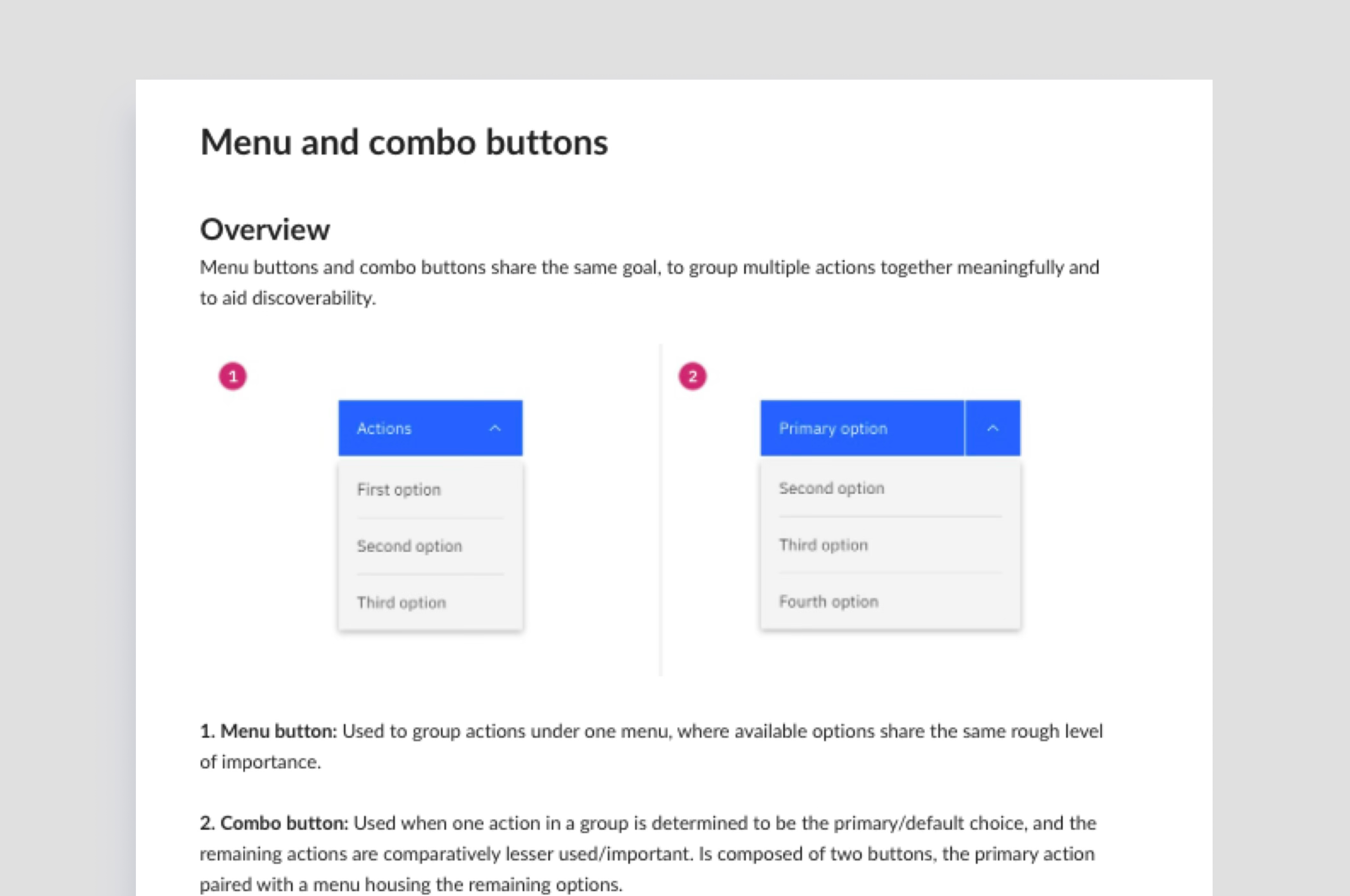
The problem wasn't the button component — it was how teams were using it. Primary buttons appeared everywhere, placement varied between products, and the same component produced vastly different experiences.
I identified the pain points, then recruited a small team to fix them. Together we created guidance covering the decisions the component docs didn't answer: which button should be primary, where they should sit, how many belong on a page, and how to maintain hierarchy.
The guidance later influenced Carbon's core button content, turning product-level lessons into system-level standards.
Full page errors
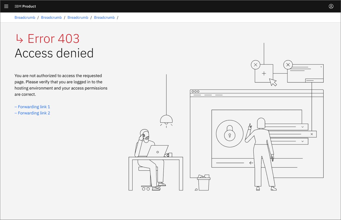
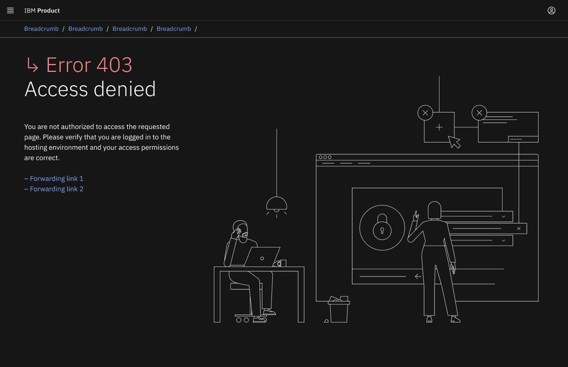
Guidance for full page errors existed — but it had real problems. The illustrations were out of date, they didn't scale to smaller screens, and they didn't support dark mode, which was in active use across the entire Security portfolio.
I led a small team to create new illustrations and updated guidance to help designers adopt full page errors more consistently.
.png)
Tag overflow
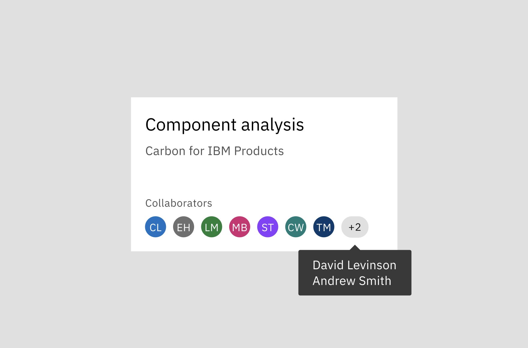
There was existing guidance for tag sets, including how to overflow tags when there wasn't enough room on screen. But there was a gap: what about other elements that needed the same overflow behaviour?
I extended the existing guidance to cover those scenarios — adding user overflow and others, based on the needs of real products.
Grid influencers
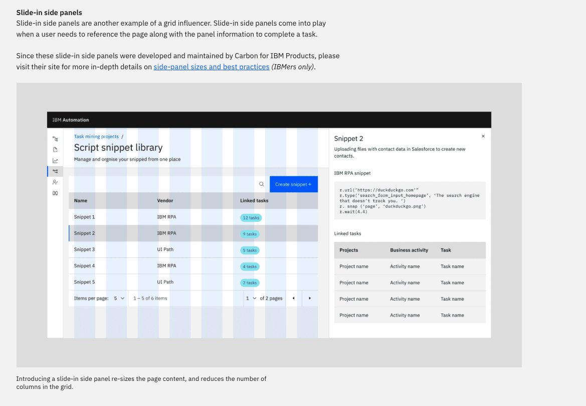
Carbon's grid guidance covered the standard layout — but teams building fixed-navigation experiences had no guidance for how side panels and left-nav patterns should interact with the grid.
I created detailed guidance and Figma assets for grid influencers: fixed UI elements that alter the available content area without disrupting the underlying grid structure.
The work was contributed upward and is now reflected in Carbon's core grid guidance — turning a product-level gap into a system-level standard.